Art Direction | Design
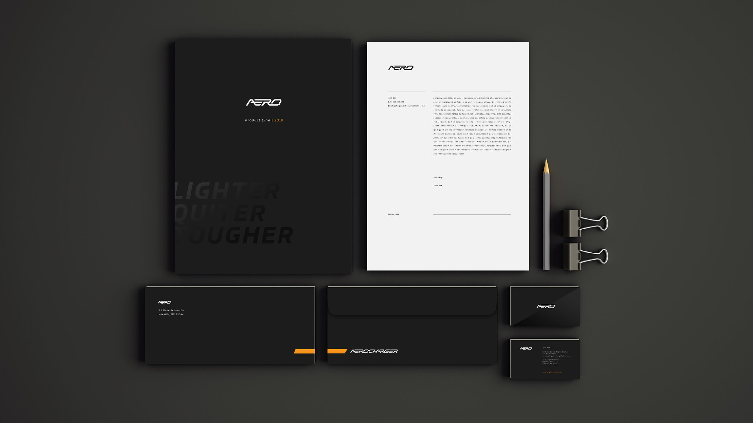
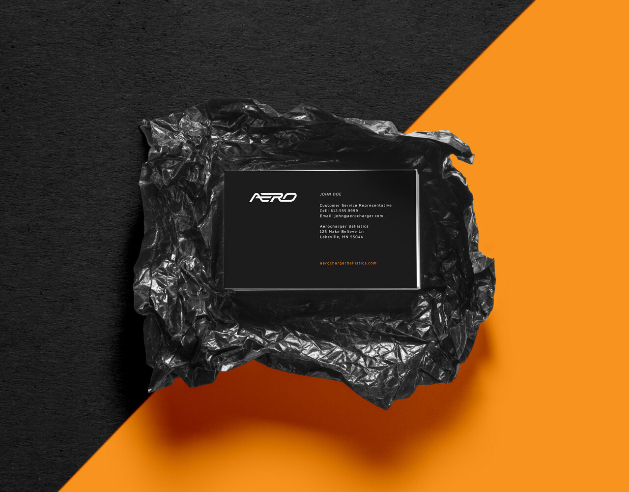
Aerocharger Ballistics — Logo & Identity
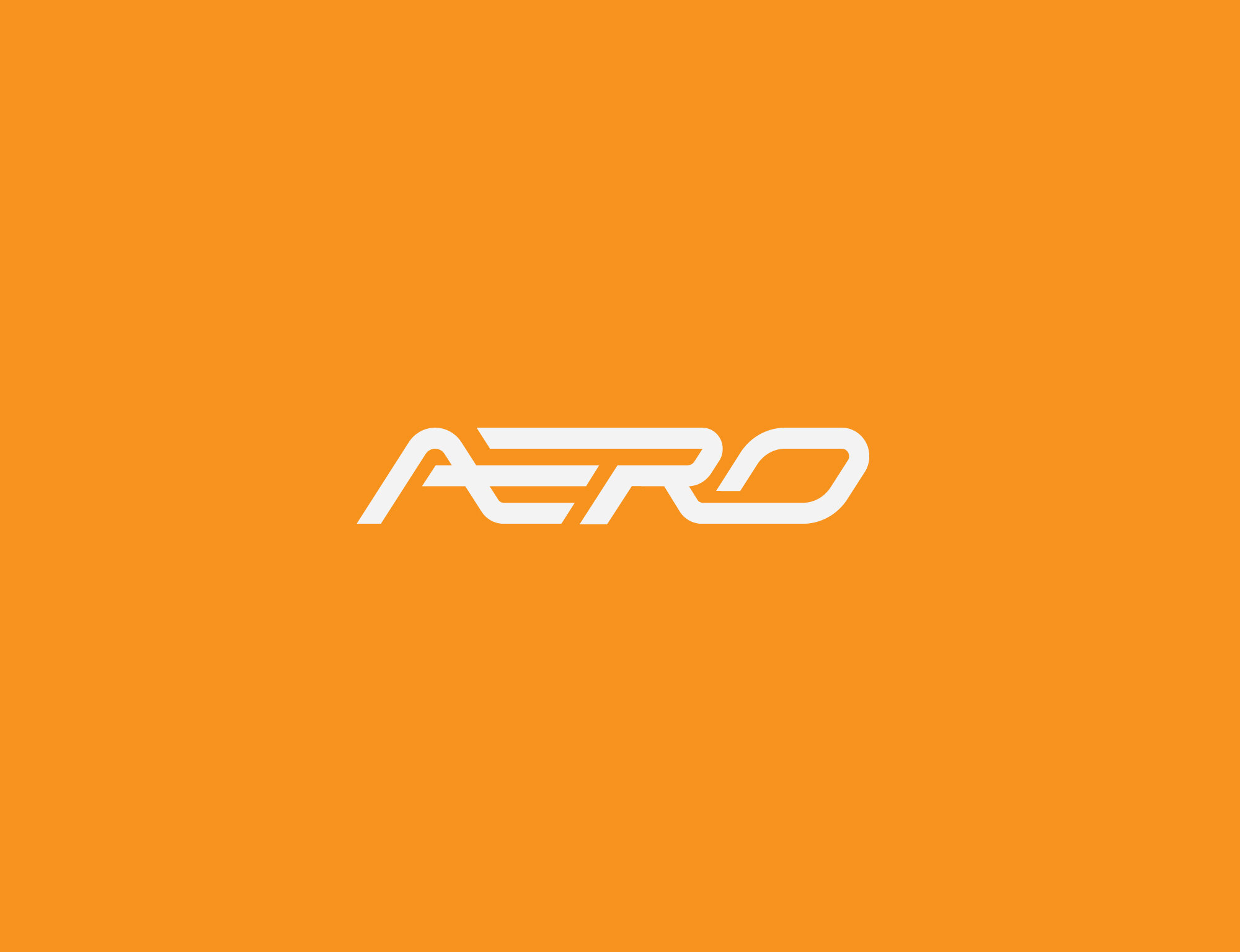
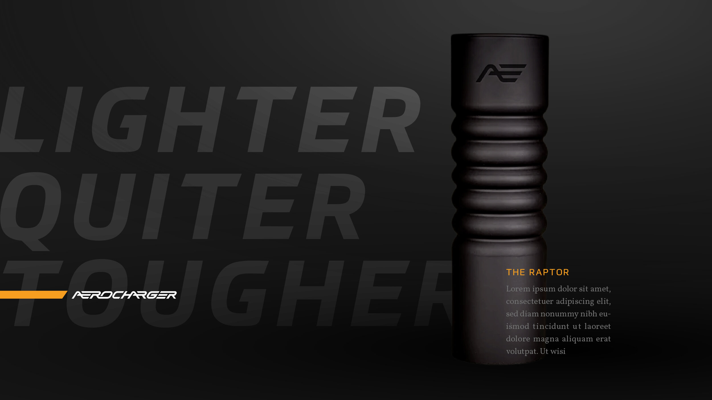
With a background in designing and building turbochargers, Aero has built a uniquely impressive product line. However, their brand presence was less-than-impressive. They needed an identity refresh to differentiate themselves in the ever-growing firearm suppressor market. I designed this mark to be sleek, active, and precise mimicking the flow and control of energy that Aero’s products provide.
A precisely engineered product deserves a precisely engineered mark. Consistent weights and angles, along with a generally right-leaning orientation reference the exacting technological advantages of the product.
Agency — 39 North


